

Friday, October 7, 2011
Why be so mean?
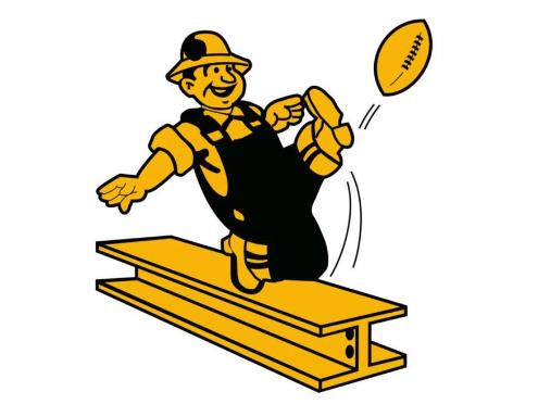
Nowadays almost every team has a mean logo. But there was a time when the logos made you smile. Like the 1960 Steelers logo.
Or the 70's Nuggets logo. These guys just like look their having so much fun.
I guess the Boston Celtics logo still looks kind of funny but they haven't changed it for decades. And I hope the won't. I can't remember the time when logos were like that. But I always love it when a team goes back to their old school uniforms and logos. Now the logos are too similar. It's most of the time a mean looking animal or a letter. In the old days the logos looked more original. Today I was browsing through the web and found this cool site with tons of old logos. Check it out.
Subscribe to:
Post Comments (Atom)
Thank you for responding to my blog. In return I honor your request to follow yours.
ReplyDeleteI guess I've never really paid much attention to logos. But I like most of the ones out there. I guess they are mostly angry looking but I don't know if it's really harmful. But I guess I respect the sentiment that sports could use a little levity in this area.
Simple rule in sports: Keep it in perspective. If we all do that we keep it fun.
For others reading this besides me I recommend this blog asportsblg.blogspot.com as well as my own nwfootballanalysis.blogspot.com. I post each week on Monday or Tuesday nights about my impressions of each NFL team. When I have time I also like to post a topic of interest in the NFL during the week as well.
Peace to all